ShowHeroes Design System
about the project
I built this design system from scratch to create a scalable foundation that’s now used by 3 different teams. It acts as a single source of truth for our tokens and components, so teams can move fast without worrying about messy code or designs drifting apart.
21d → 4d
delivery speed boost
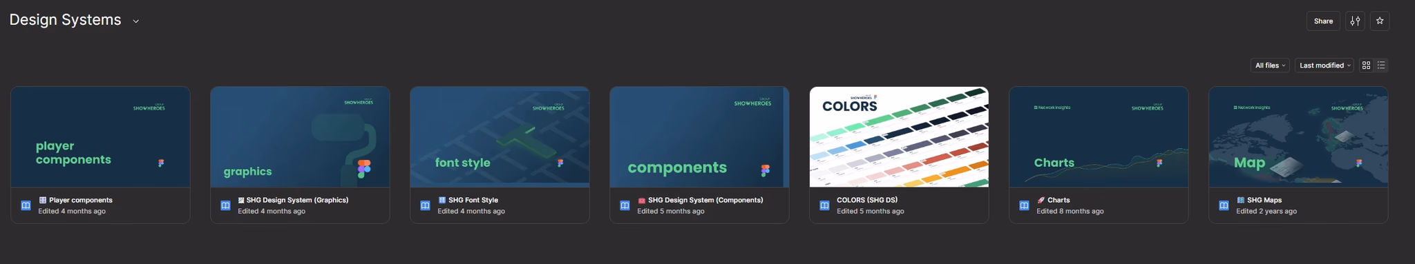
3
products
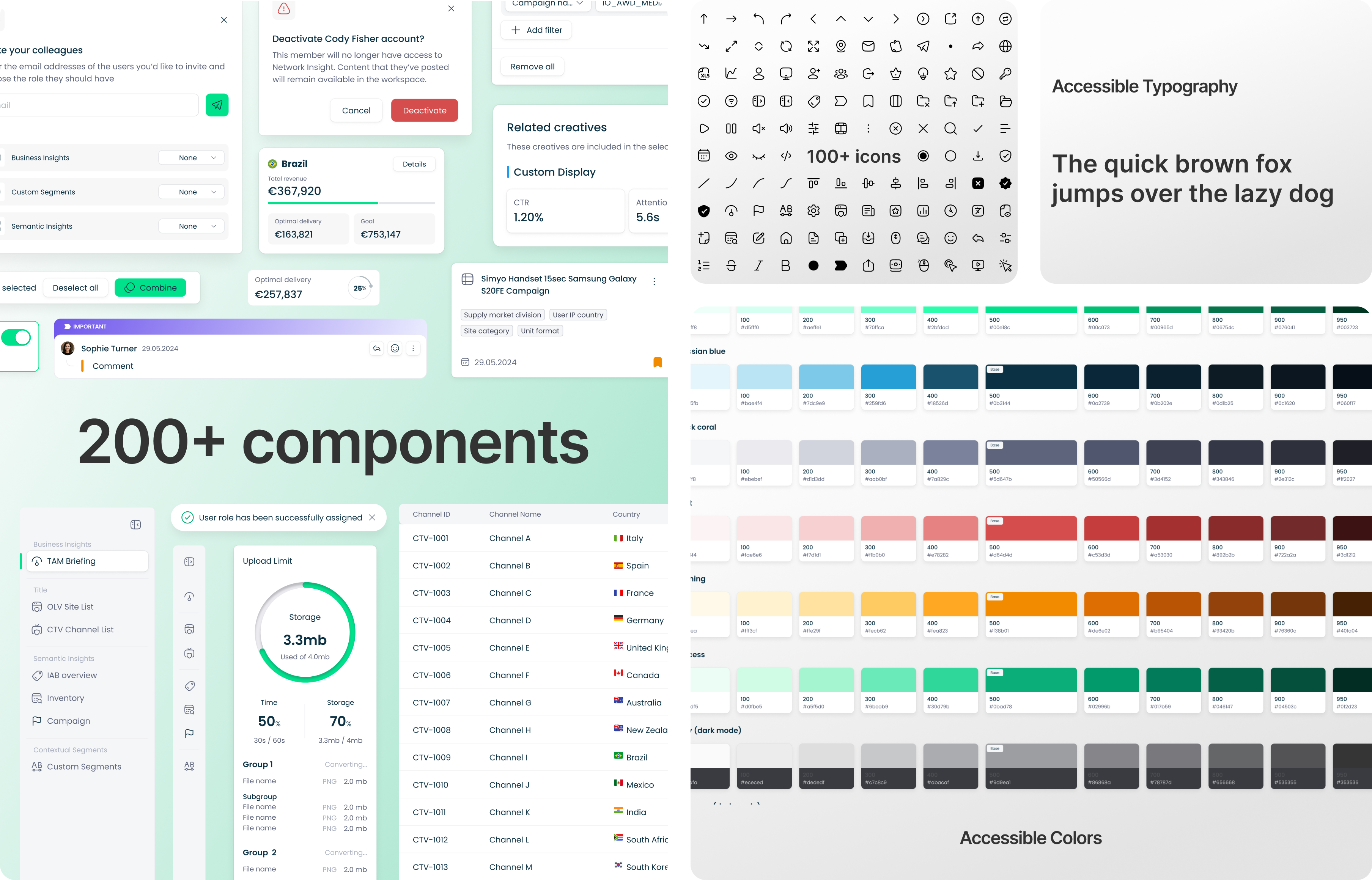
200+
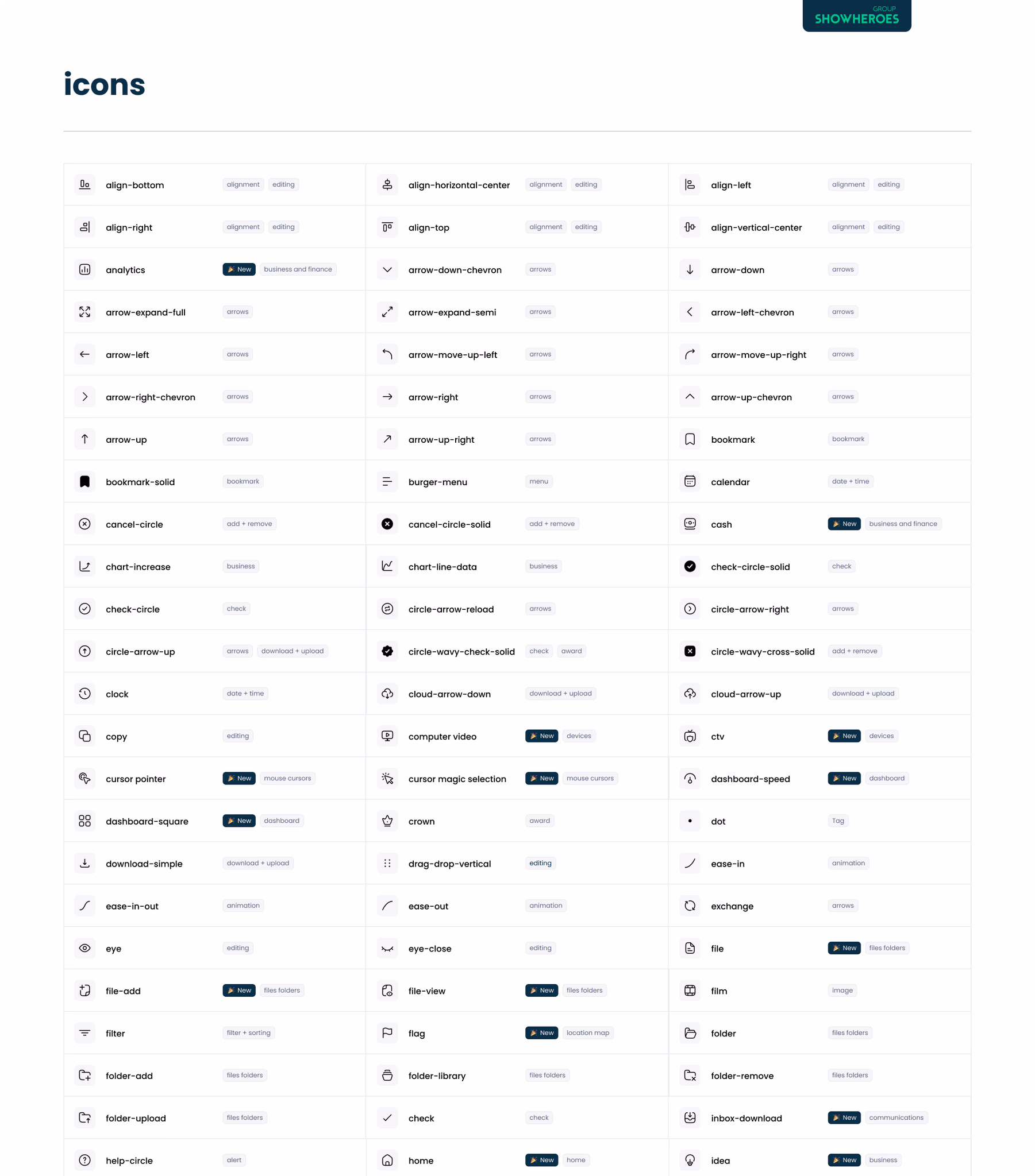
components
my role
I initiated the system and owned the entire architecture from the token logic to the Figma libraries and how they’re used across products.
problems to solve
- No single source of truth → inconsistent UI everywhere.
- Designers and devs duplicating work.
- Maintenance becoming a nightmare.
- Development slowed down due to rework and misalignment.
my goals
- Get everyone speaking the same UI language.
- Speed up the design-to-dev cycle.
- Maintained high quality.
key decisions
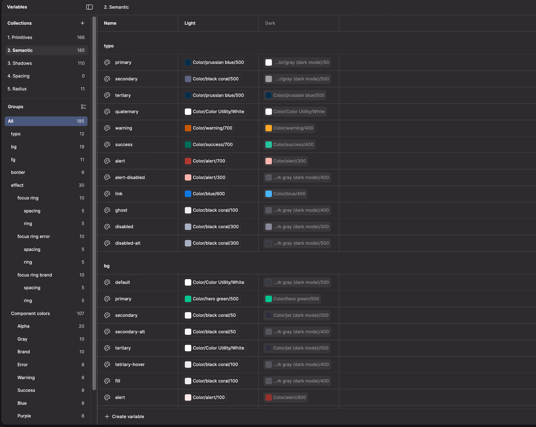
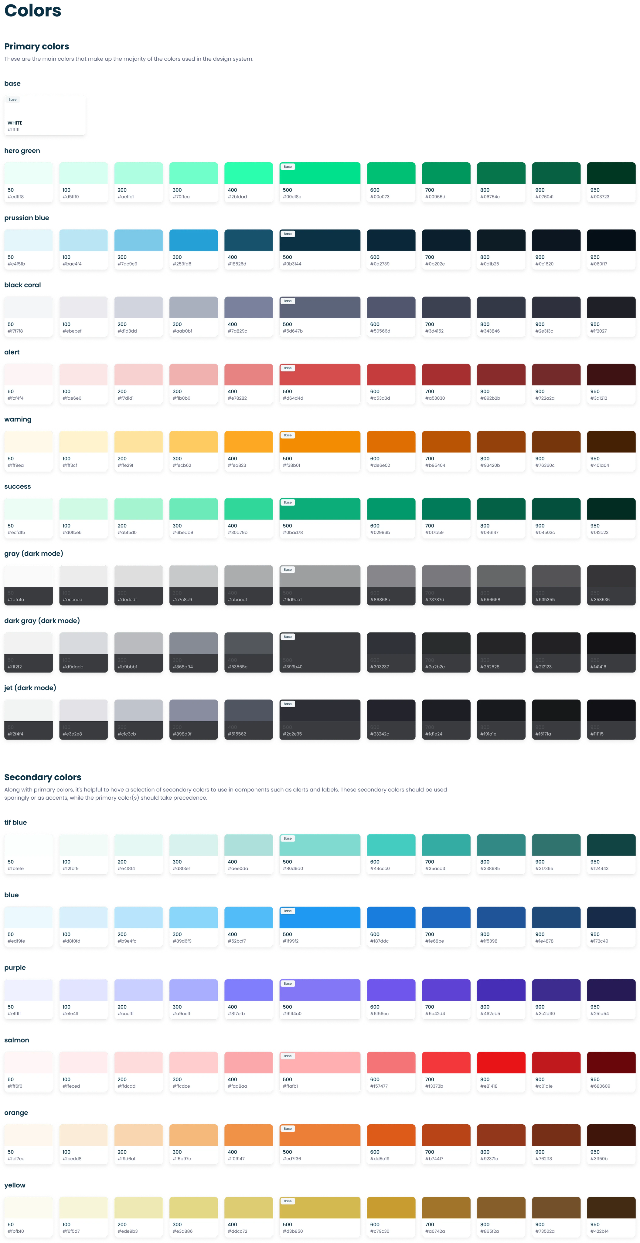
- Built a token architecture to separate raw values (Primitives) from their actual purpose (Semantics).
- Baked light and dark modes directly into the system level. By using semantic tokens, products can switch their look and feel instantly.
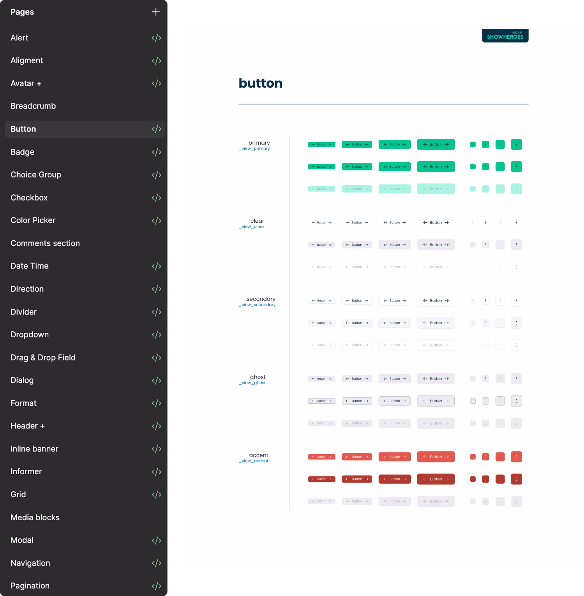
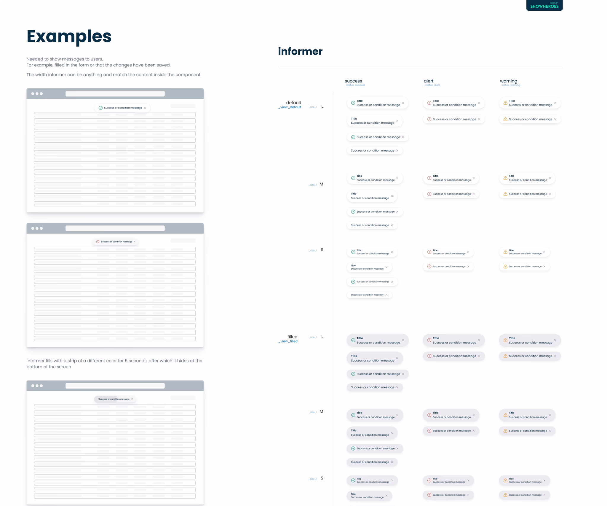
- Structured our Figma libraries to make life easier for the team. With standardized variants, designers and engineering can work faster.
- Created dedicated libraries for specific areas like analytics charts, maps and the video player so we don't have to build ad-hoc solutions every time.
the results
- Increased the average delivery time from 21 days to 4 days.
- One Source of Truth: No more “which version of the button is this?”
- Faster Iteration: Teams can now focus on UX problems instead of pushing pixels.
- Centralized Governance: maintenance is cheaper because we fix things in one place, and it updates everywhere.
Team
Yauheni Salau
Kay Schneider (President at ShowHeroes Group)