Redesigning a Video Player Ecosystem for Content and Ads
about the project
We were managing two separate products, a Content Player and an Ad Player. They worked, but the UI was starting to show its age, navigation felt cluttered, and they weren't built for the interactive features we wanted to launch.
I led the redesign to create a unified visual system that gave publishers more flexibility and made the entire experience feel like one smooth, connected product.
+5%
revenue
+16%
content impressions
+10%
ad impressions
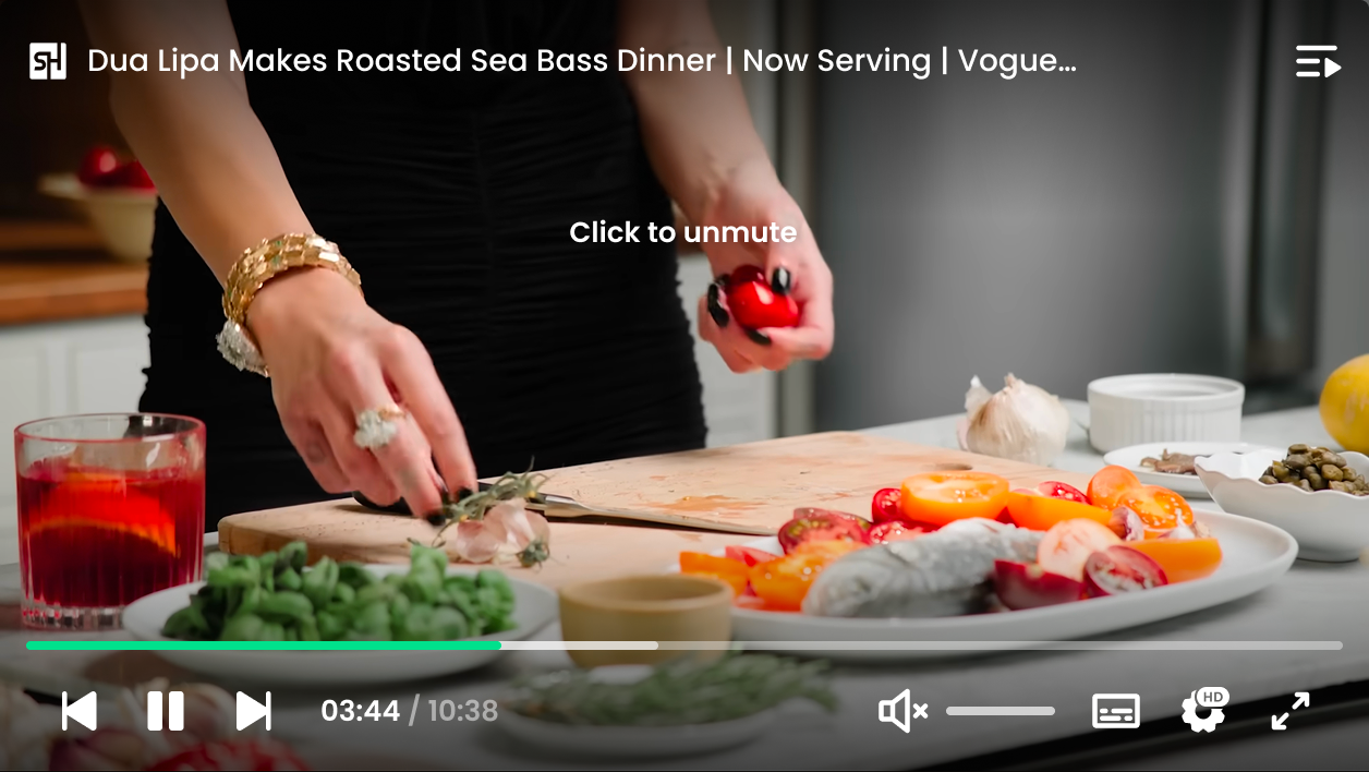
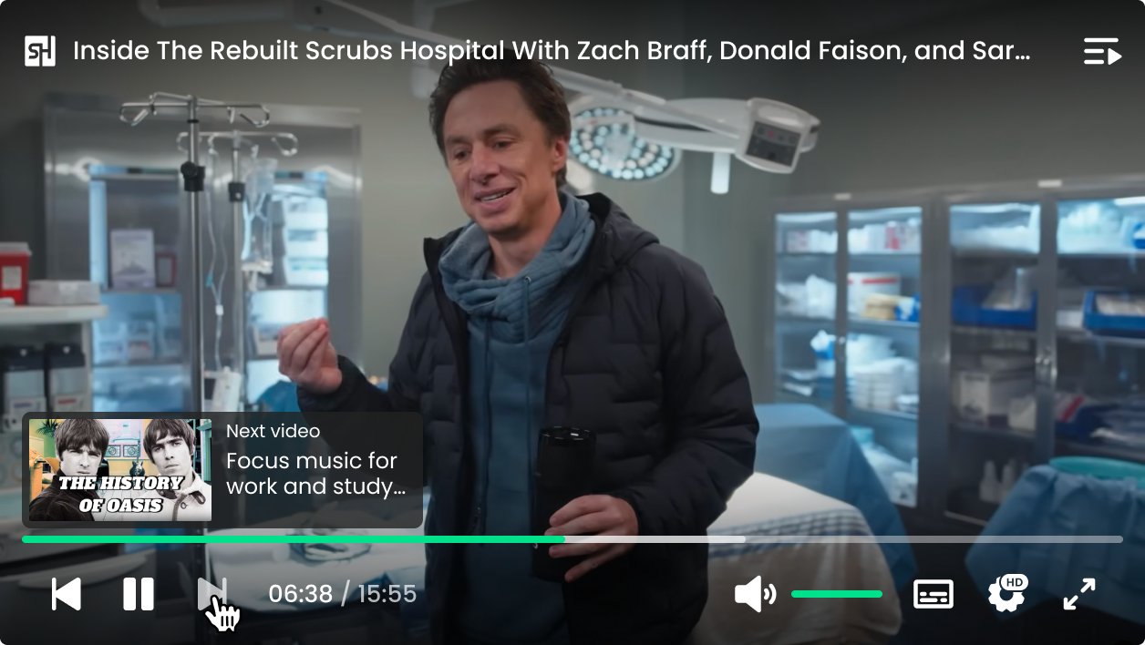
Redesigned Player Interface
my role
I led the redesign for both players, from the core UI to specific features like the Clipchoice interactive format and playlists. I also helped build a unified component library to keep our design consistent across the board. To make sure we were moving in the right direction, I worked closely with engineering and product through 15 A/B tests to iterate safely and drive KPI growth.
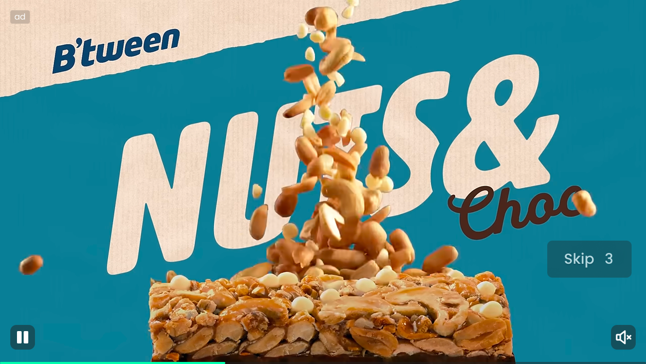
Ad Player
VIP Mode for Content Player
problems to solve
- The old player was strictly linear which made it impossible to launch the interactive features we were planning.
- Limited customization meant brands couldn’t easily adapt the player to match their own unique look and feel.
- The UI was stuck in the past and the navigation felt too limited, which kept the viewing experience from feeling truly modern.
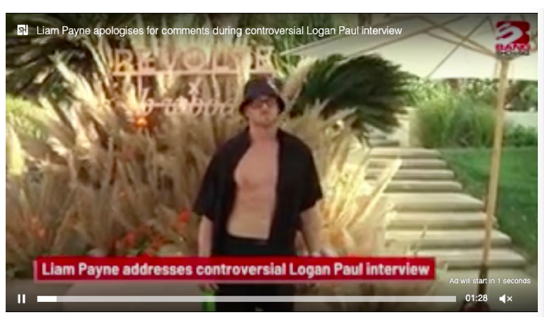
Previous Player UI
my goals
- Refresh both players with a modern UI that is much easier for people to use.
- Integrate the new Clipchoice format to bring interactivity to our video ads.
- Build a playlist system to help users discover more content and stay on the platform longer.
- Focus on growing key metrics like unit fill rate and revenue through better design.
- Create a unified design language to keep the experience consistent across every player.
Clipchoice format
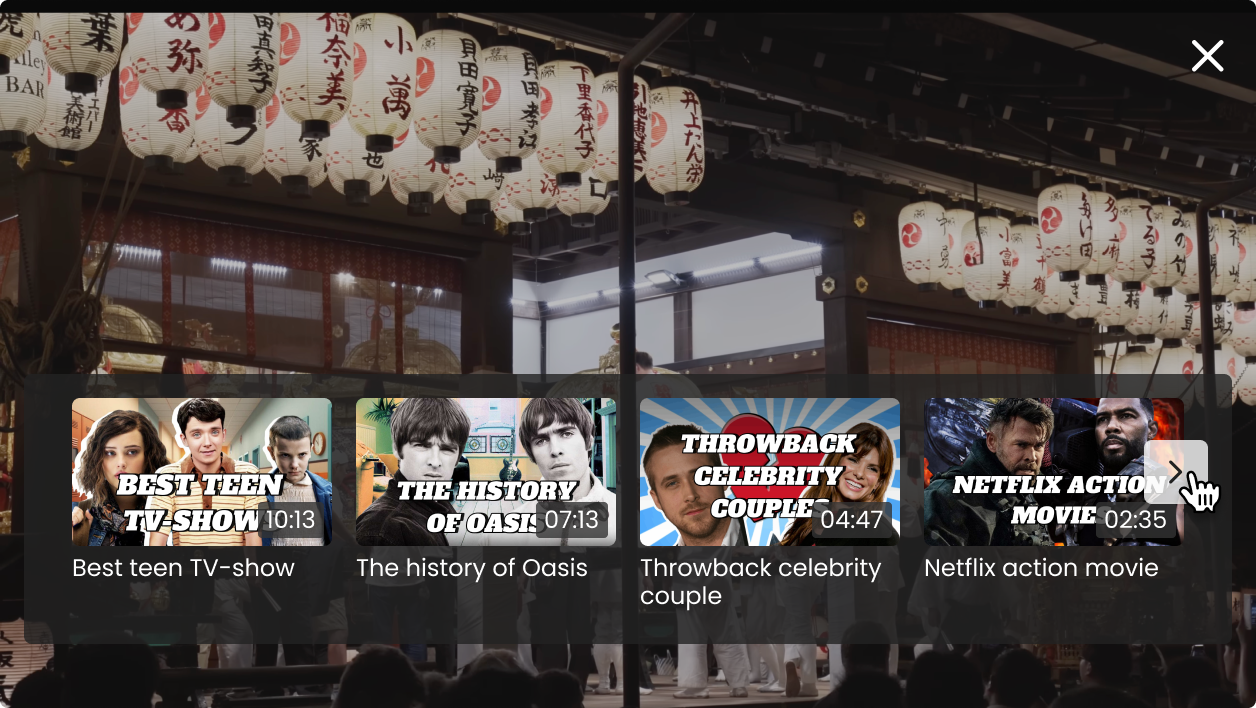
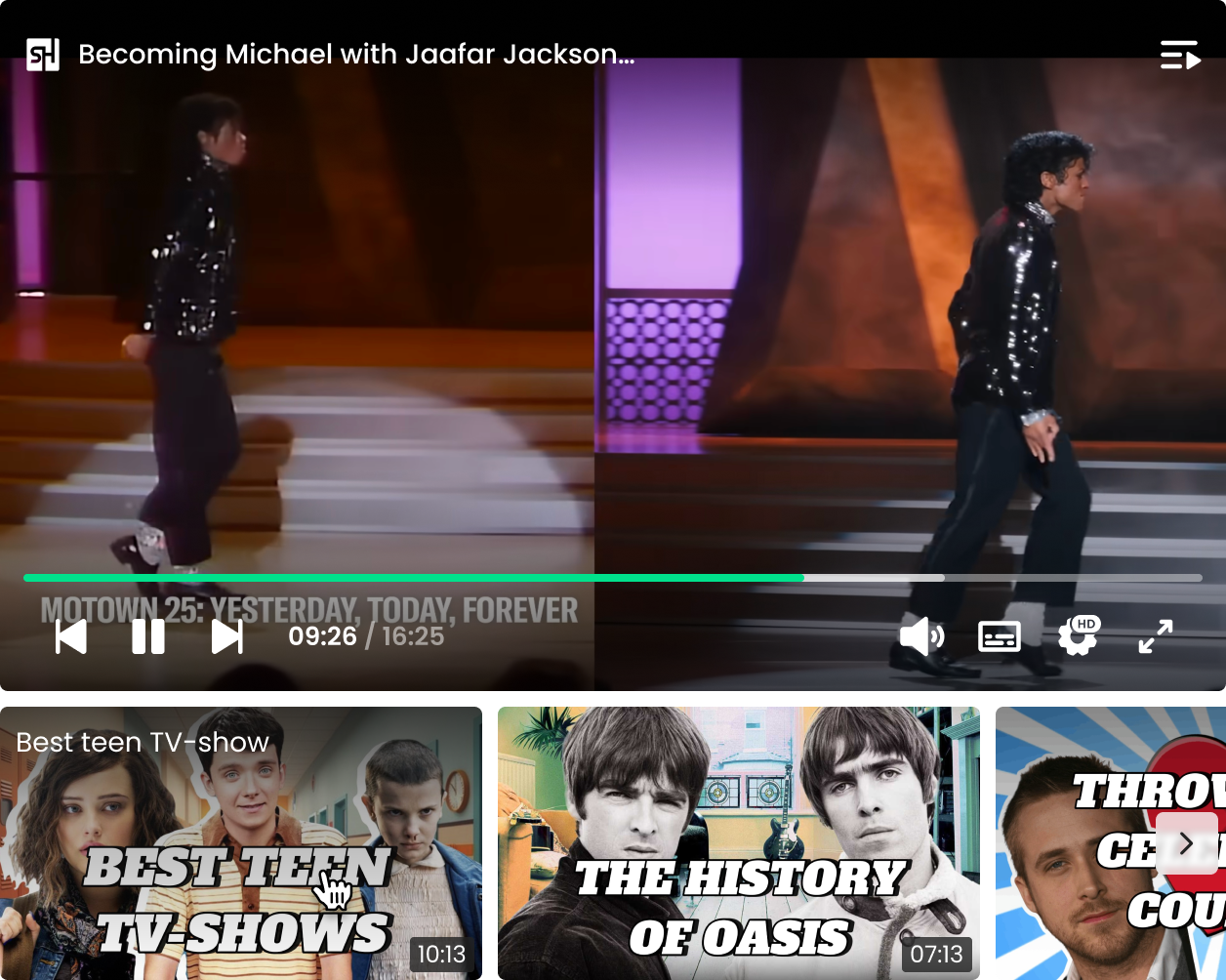
Playlist
key decisions
- Redesigned the core UI and navigation for both players to prioritize clarity and strip away any unnecessary visual noise.
- Introduced playlists to make it faster for viewers to move between videos and stay focused on the content for longer.
- Created a unified component system to align the visual style across both players and finally get rid of all the inconsistencies.
- We ran 15 A/B tests to validate our hypotheses and make sure every design change actually worked for the users.
- Also drafted a concept for a Live Streaming player as a future direction, making sure we were prepared for the next step without slowing down our current roadmap.
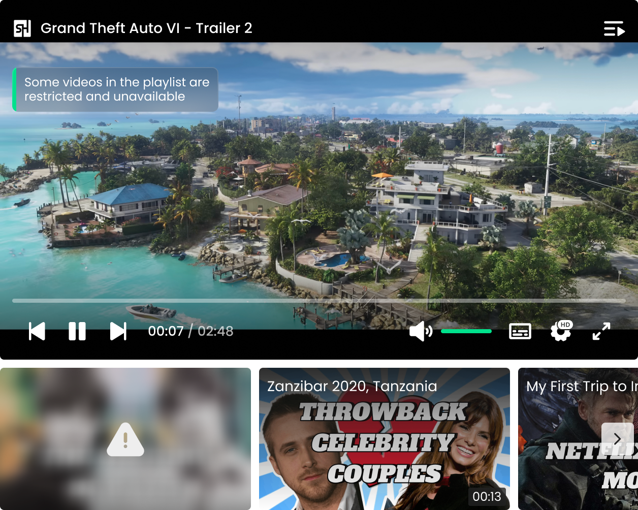
Global + item-level alerts for unavailable videos
the results
- Boosted unit fill rate and ad impressions by 10% through a more effective player design.
- Increased content impressions by 16% and total revenue by 5% after the full rollout.
- Proven reliability with zero rollbacks in 2.5 years because our experimentation process allowed us to catch and fix issues early.
- Our iterative approach allowed us to fix early performance issues and turn an initial dip into long-term growth once the new UI and features were fully rolled out.
Team